Sector's Edge - Allegiance + UX
Rocket and I have spent the past month improving the tedious, unintuitive parts of the Sector's Edge UI and exploring a new compelling, rewarding and unique progression system.
Rocket and I have spent the past month improving the tedious, unintuitive parts of the Sector's Edge UI and exploring a new compelling, rewarding and unique progression system.
The changes in this blog post will be implemented in the Attachment Update, which will be available for testing in our next Public Beta Testing event.
Home
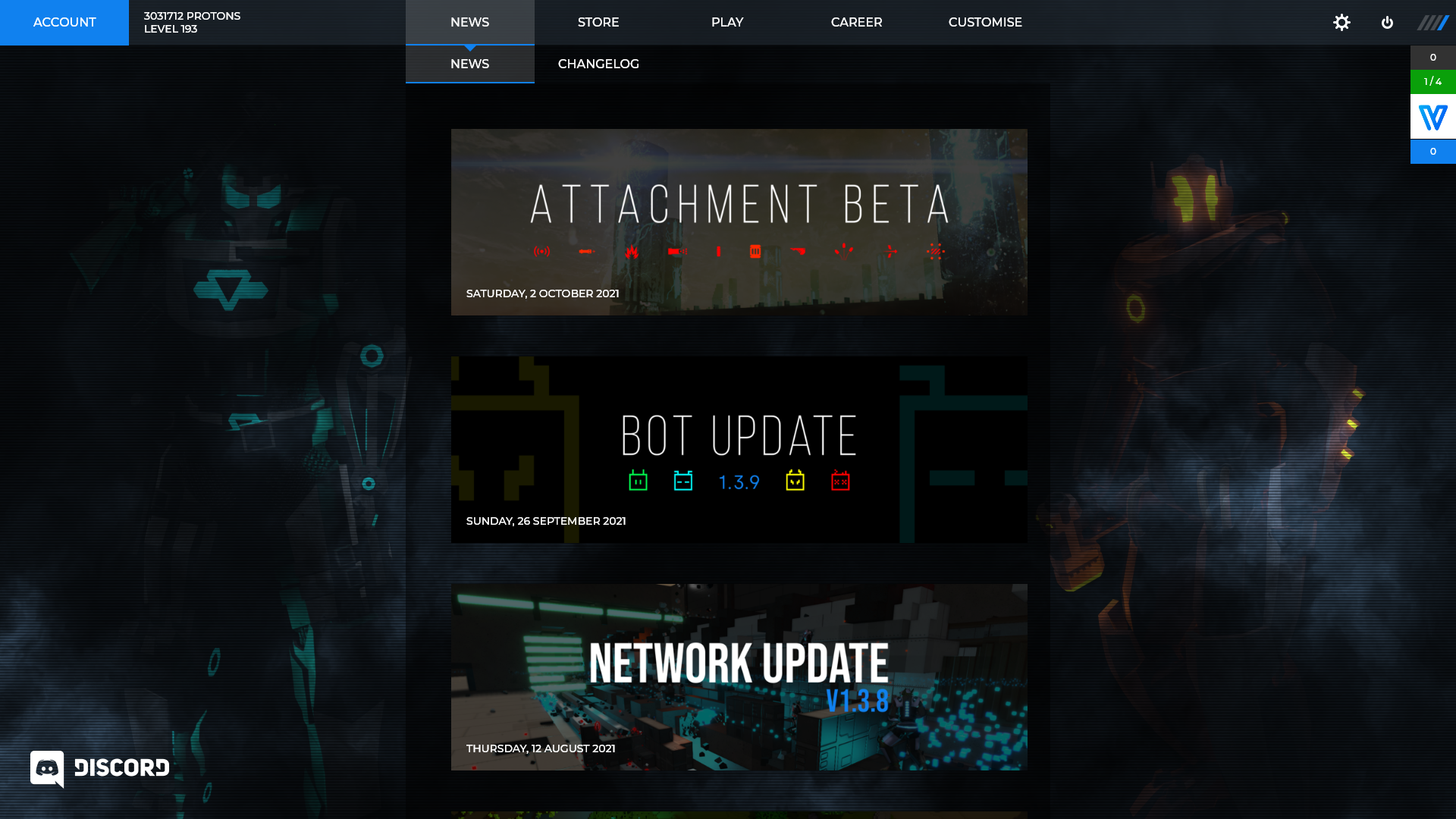
Currently the home screen contains a list of Steam news posts and a dark animated smokey background. While I think the background is cool, it's very gloomy and needs to be livened up:
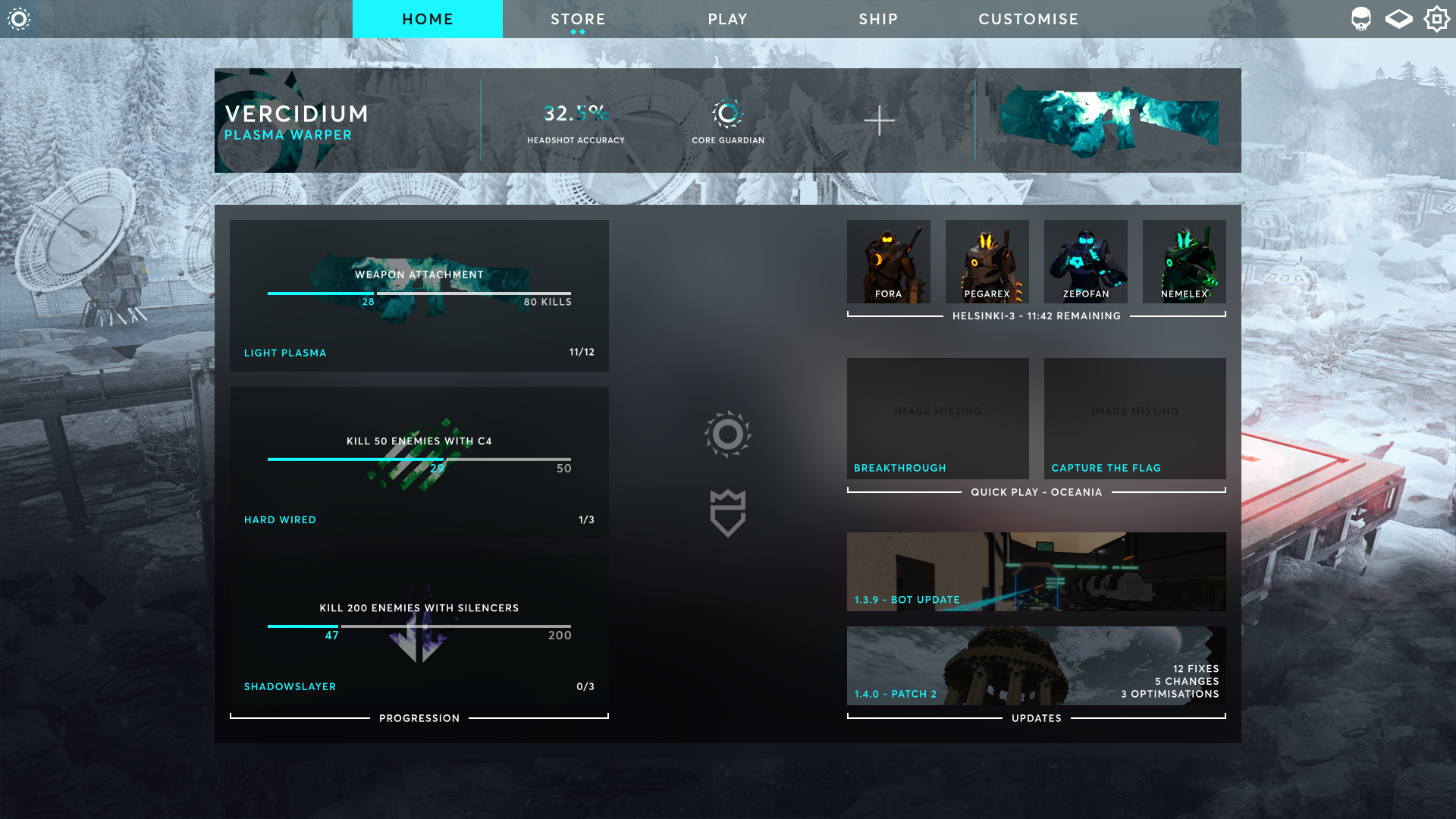
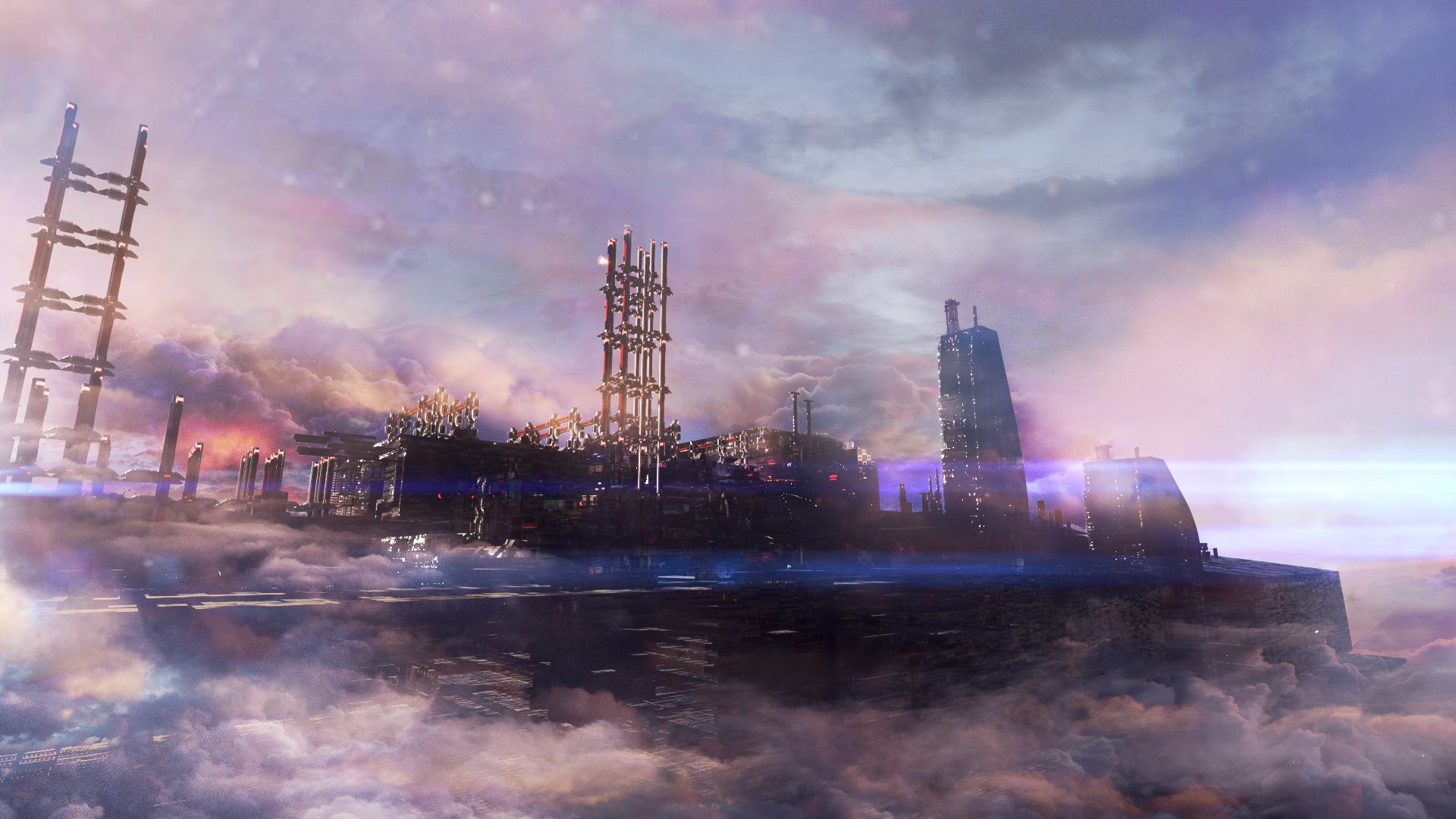
We recently started working with artist Juan Moreno, who is creating artwork for each of our maps. We love his Ice Station piece and have decided to use it as the background on a brand new home screen, which is divided into the following categories:
- Player ID - shows what the player has achieved. This is customisable and is shown to enemies that they kill in-game
- Progression - reminds the player what they're working on and what's next
- Quick Play - simplifies the server selection process with an option to quickly jump in to a game
- Active Friends - this is a scrollable list of friends that are currently in game
- Party - this shows a list of party invites (if any) and a prompt to create a party
- News and Patch Notes - helps players stay up to date with what's new
Navigation
To increase screen space, I reduced the top navigation bar from 60px to 50px high and removed the 2nd navigation bar row (more details on where this disappeared to below). The social sidebar on the right has been collapsed into the social button (third from the right) as it was consuming horizontal space and clashed with some UI elements.
Now each page has the same amount of screen space as the only persistent element across each page is the top navigation bar.

When clicking the 'Customise' tab, the buttons on the navigation bar are replaced with the customisation buttons, and the breadcrumbs element appears on the left:

The breadcrumbs element displays the navigation tree that the player traversed to reach the current page. Players can then click on 'Home' or 'Loadout List' to go back to a previous page.
Player ID
Featured at the top of the new home page is what we call your Player ID. It's a customisable banner that represents the player and the things they have achieved while playing Sector's Edge.
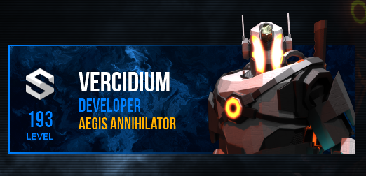
The old Player ID shows your:
- Name (Vercidium)
- Title (Developer)
- Tag (Aegis Annihilator)
- Level (193)
- Character (Agaman Engineer)
The new Player ID has the following customisation options:
- Allegiance background (far left)
- A single title (below player name)
- Three Feature Slots (center)
- Weapon/character showcase (far right)
- Background style (applies to all elements)
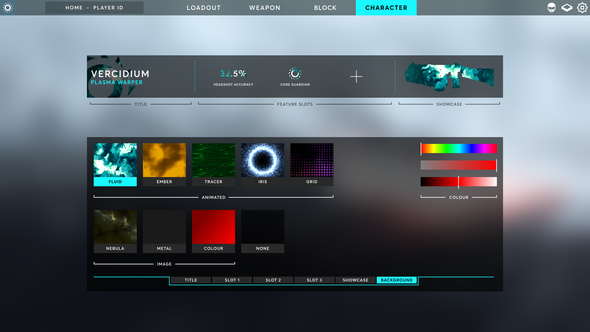
The Tag below the player's Title in the old Player ID has been removed and in it's place Feature Slots have been added. This is where players can display what that they have achieved in game, such as:
- Player statistics (KDR, accuracy, time played, matches won, etc)
- Weapon statistics (grenade kills, rail gun headshots, LMG damage dealt, etc)
- Tasks
Tasks are a new feature that will be added in the Attachment Update. Each task has a unique name and icon that can be displayed in a Feature Slot on the Player ID. More information on Tasks can be found further in this blog post.
Title Selection
The old title/tags UI was overwhelming and difficult to navigate. To improve this, I added a search bar and grouped similar titles together. Hovering over a title will show a description on the left that describes how this title was unlocked, i.e. '100 Rocket Rifle kills'.
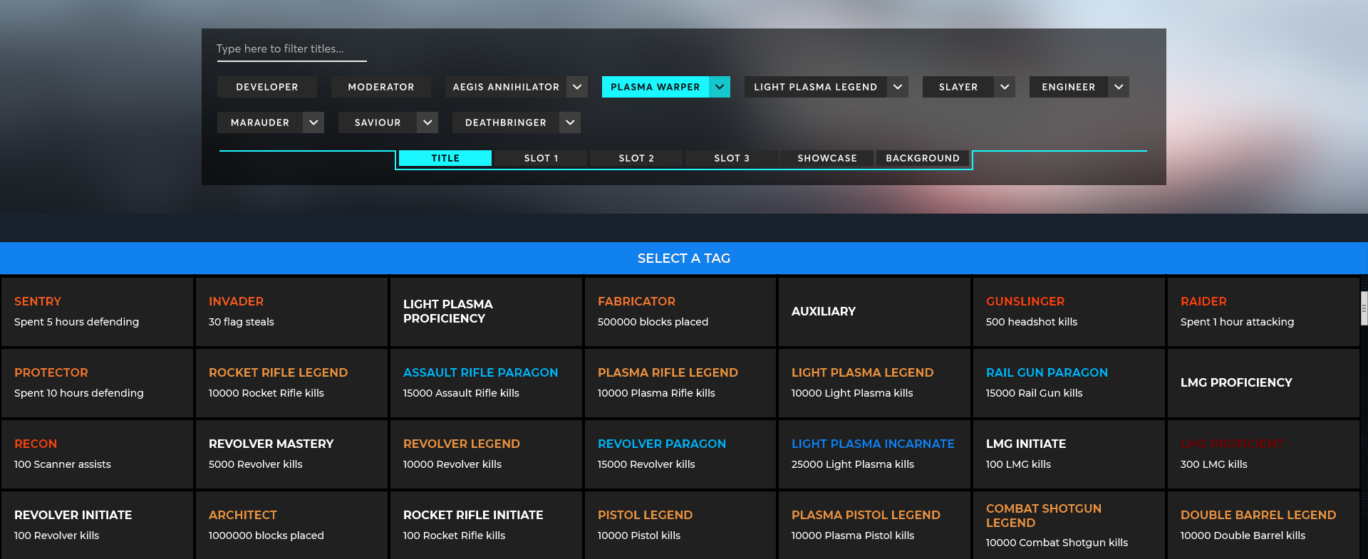
Titles that are grouped together will expand when clicking the dropdown arrow next to it, which allows the player to equip others variations of this title that they have unlocked:

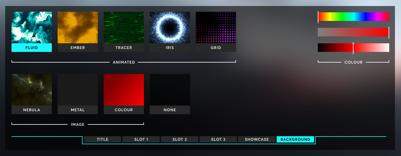
The new Player ID customisation also explores backgrounds/styles in more detail:
- Once a player has unlocked a background - e.g. the Fluid background unlocks when reaching a few thousand kills with any weapon - they can then equip it with any combination of titles/showcase/feature slots.
- Players can now also customise the colour of the background effects using hue, saturation and lightness sliders.
Weapon Presets
A common feature request has been the ability to customise weapons differently in each loadout. To address this I implemented weapon presets, which allows players to create a combination of attachments, sights and skins that can be reused across multiple loadouts.
In the example below I am editing my 'Quiet + Removed Stock' preset and hovering over the 'Resonator' barrel attachment, which causes the attachment statistics panel on the left to appear.
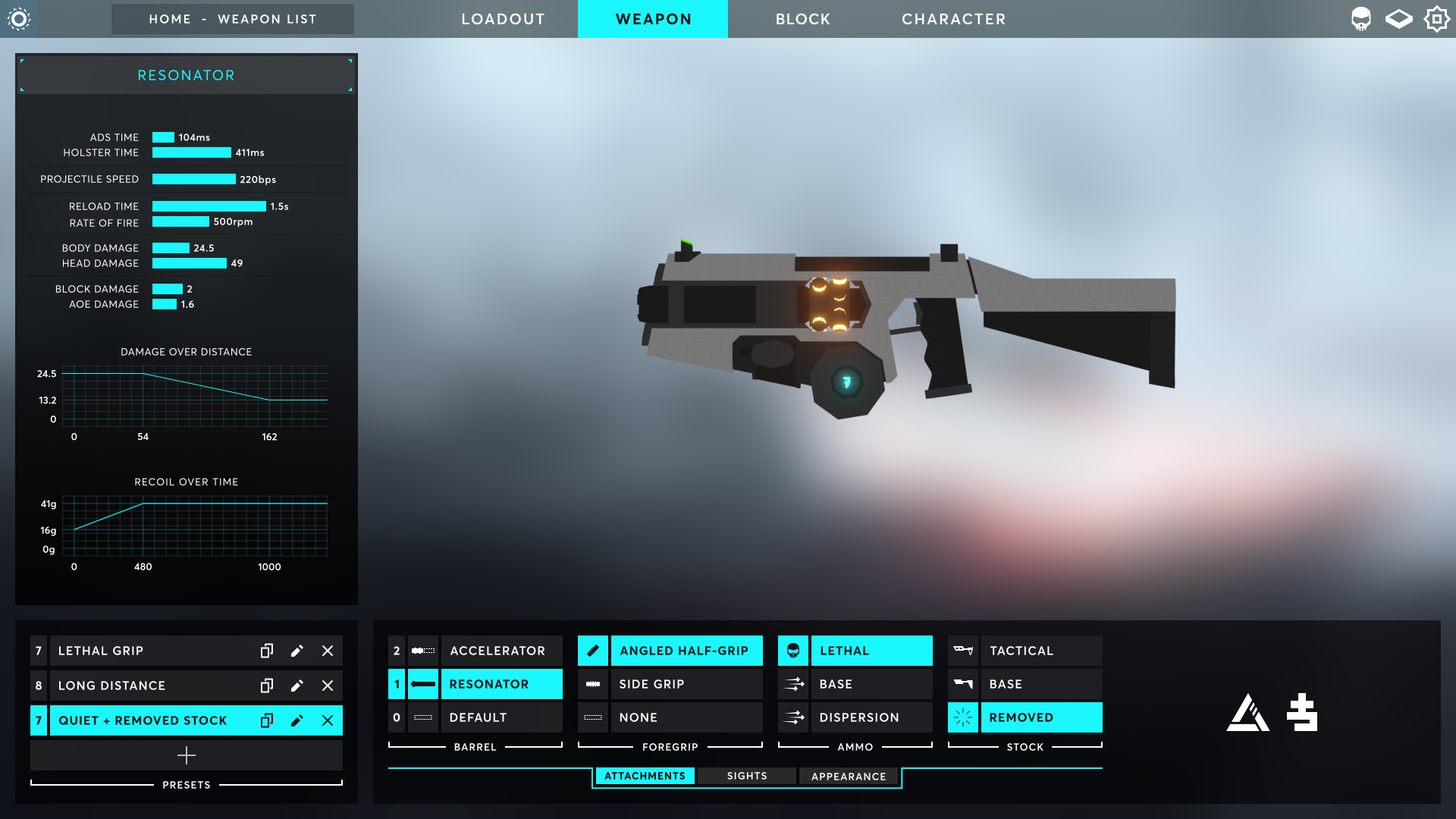
The above UI is missing the weapon list from the old UI. This has been separated into a separate weapon list page (notice the breadcrumbs in the above screenshot).
The three tabs (Attachment, Sight and Appearance) refer to additional functionality that expands on the Attachment System from the last beta. If a player wishes to have the same red-dot crosshair style on each of their guns, they can create a red-dot Sight preset and then equip that on each of their weapons.
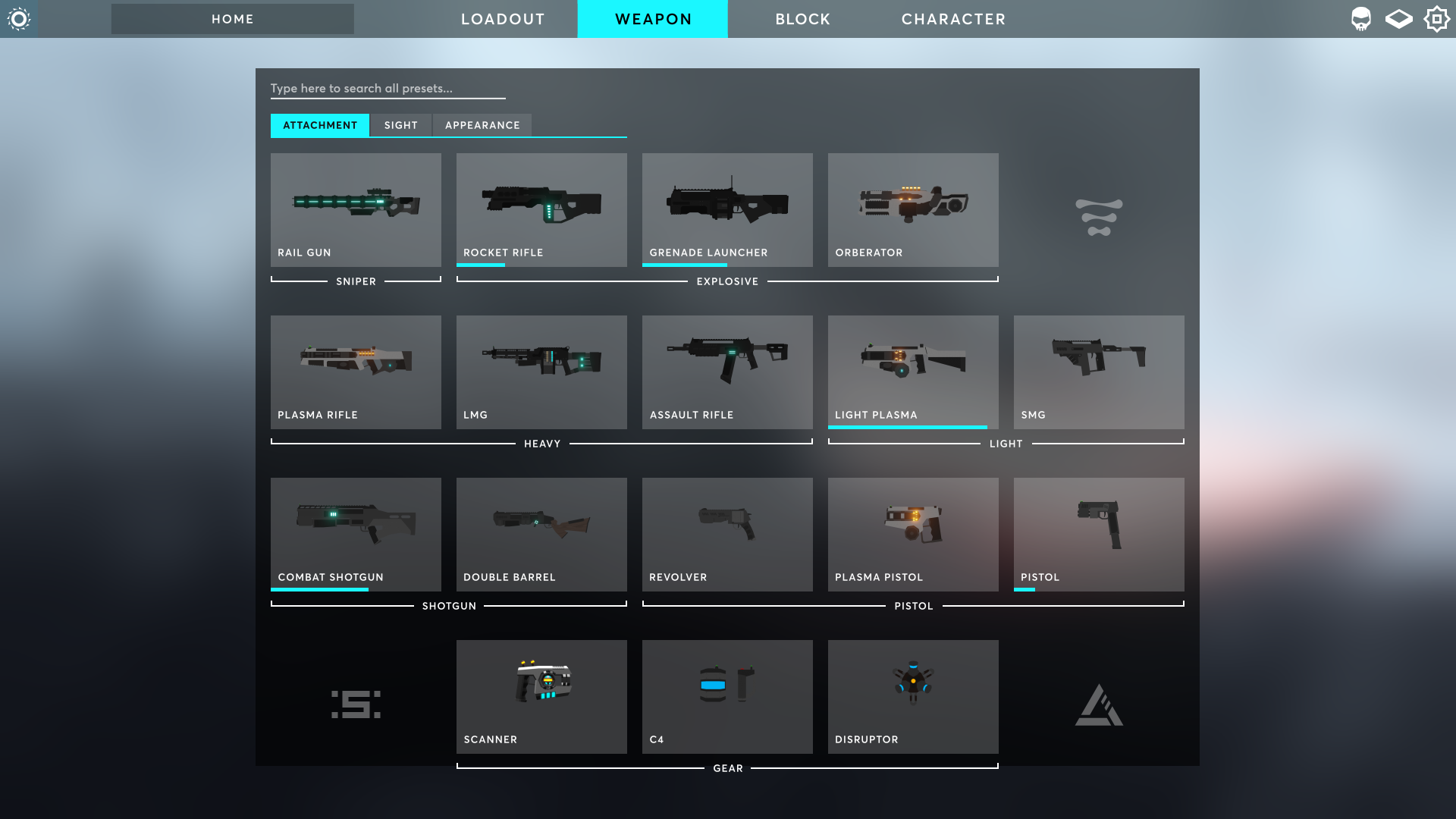
I'm using allegiance symbols to fill in the dead space and to integrate with the lore, allegiances and manufacturers of the weapons.
Loadouts
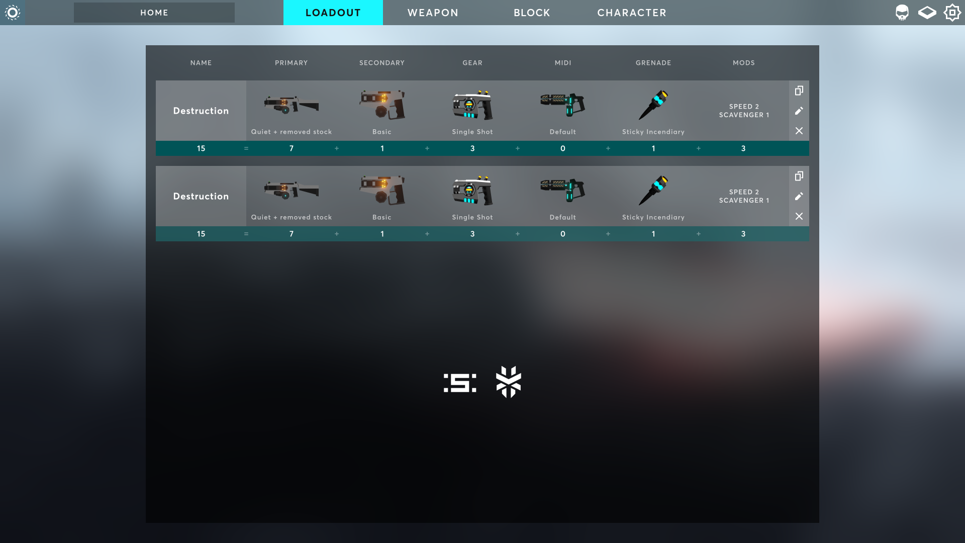
The loadout list has been extracted from a simple sidebar into a full-page list, which allows players to easily compare the contents of each loadout.
Crosshair Customisation
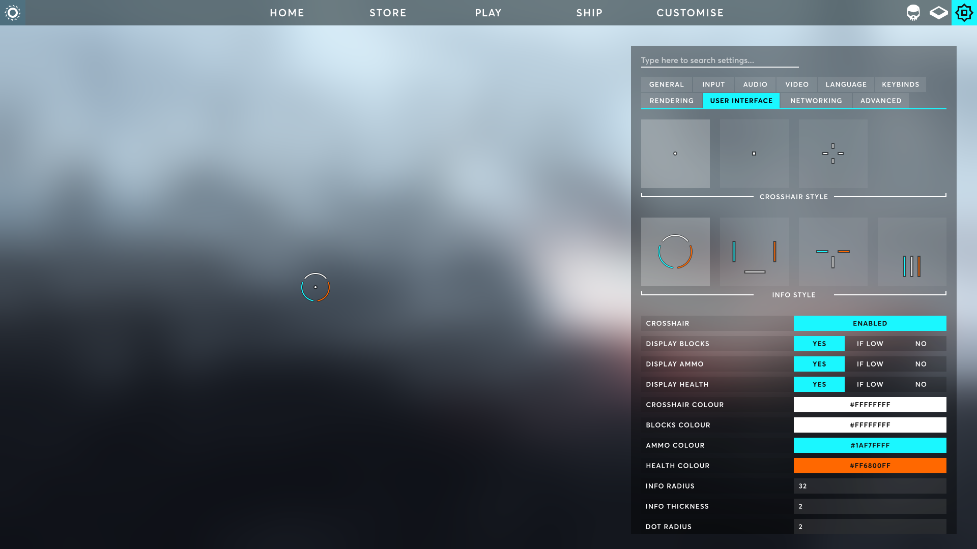
This update allows players to customise their crosshair and control what information should be shown around it.
Players can control the colour, opacity, size, radius and thickness of each element on their crosshair.
HUD Customisation
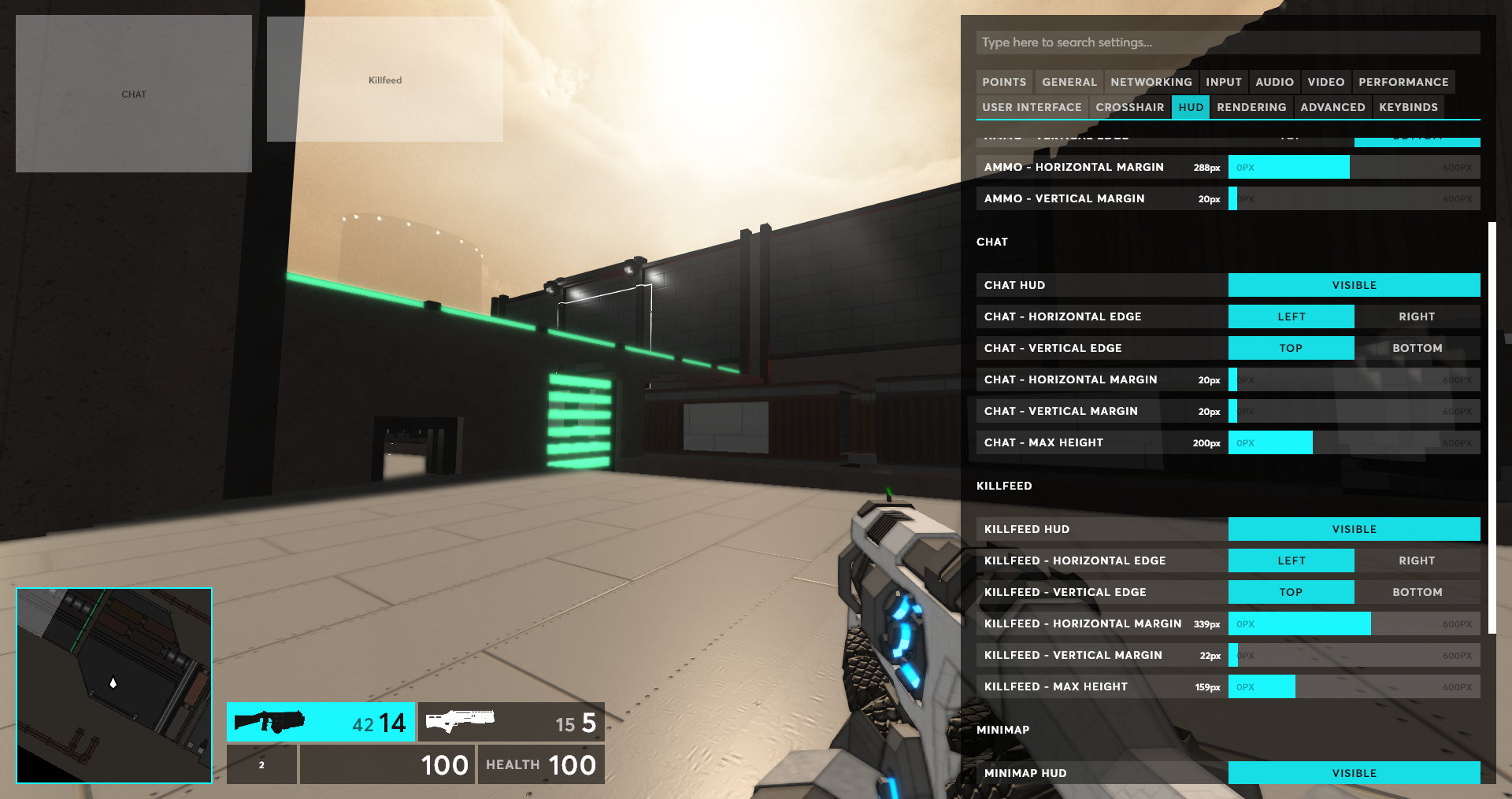
This feature has been requested for a long time and it's finally available! Players can customise these aspects of the chat, killfeed, minimap and ammo UI:
- Horizontal and vertical edge (i.e. top-left, bottom-right, etc)
- Horizontal and vertical distance from the edge of the screen
- Max height of the chat and killfeed
- Height and width of the minimap
Scoreboard
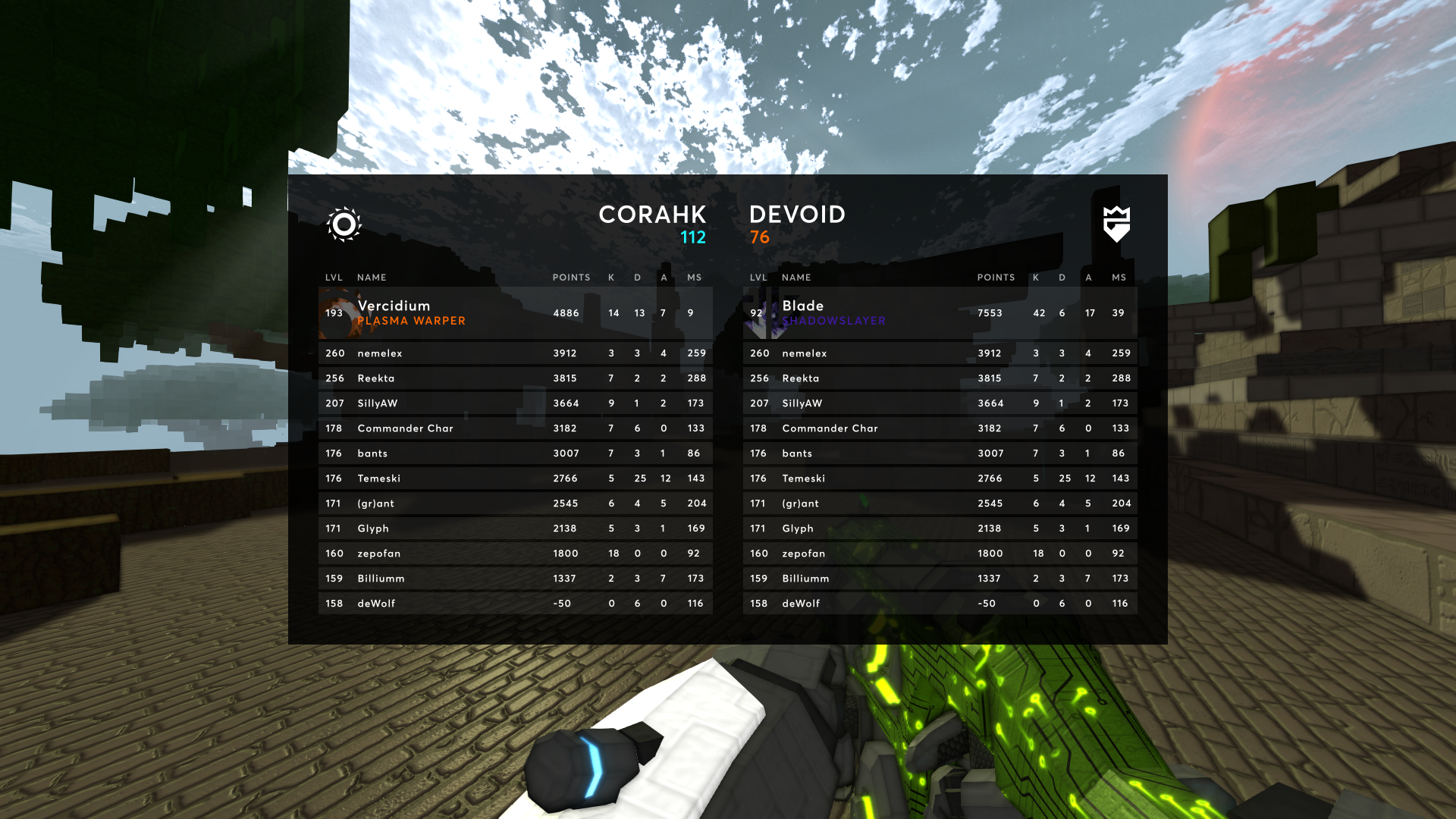
The scoreboard has received a fresh coat of paint, with a feature that I've wanted for quite a while: a top-player showcase. The top player on each team will have a taller row on the scoreboard to showcase their Player ID.
Salvage Rework
I am planning to replace the canisters in the Salvage game mode with Soltrium meteors that fall from the sky and impact into the ground. You can see these meteors as they fall, so you can predict where they will impact.
Some will impact on the surface and some will inset into the ground a few blocks and leave a small crater. These meteors will be a small sphere of indestructible 'Soltrium rock' blocks (2 or 3 block radius).
Meteors will spawn in groups of 1 or 2 at ~4 minute intervals (will have to balance the interval based on how quickly these meteors end up being depleted).
Rather than simply standing near the meteor, players can place an 'extraction' device on a surface of a meteor block, similar to how C4 is placed.
- This device will extract one point for your team per 10 seconds
- You can destroy enemy extraction devices, but you have to run up to it and melee it. This is because I don't want orb spam to kill the devices
- You can only have one active extraction device at a time. If yours is destroyed, you can re-place it without needing to respawn
- Once an extraction device has depleted a meteor block, it will destroy the block and move itself to a nearby meteor block
- For example, if your team has 12 active extraction devices, your team will be earning 12 points per 10 seconds. 12 is the max since there's 12 people on each team - You will gain personal points each time your extraction device earns a point for your team
Planned benefits:
- Fighting is more spread out across the map, rather than clumped into one point
- Players have the ability to directly contribute to their team by placing their device on a meteor block
- Players have something tangible to defend
Clarifications:
- In maps like Magma Chamber and Crashed Freighter where canisters spawn under cover, the meteors will crash through the terrain until they reach the designated 'spawn point', meaning there will be a gaping hole in the ceiling.
- Players place their extraction devices by running up to an available meteor block face and pressing
E - Meteors will be visible on the minimap
- Friendly and enemy extraction devices will be visible on the minimap
Let me know your thoughts!
No Loading Screens
When a match finishes, players will no longer disconnect and re-connect to the server. Instead, players will be presented with these new screen when the match finishes.
During this time, players can vote for the next map + game mode and continue chatting + viewing stats while the server loads the next map in the background.
Once the map has loaded in, players will not be forced to join straight away. There will be a one minute grace period for players to continue browsing stats before they will be required to spawn in, else get kicked out of the server.
This new process means the server can balance teams based on the results of the previous match, and players no longer need to wait the 40 seconds at the start of the match while the server waits for people to join.
Players who wish to spend more time browsing stats are able to, and players who want less dead-time between matches can jump right in.
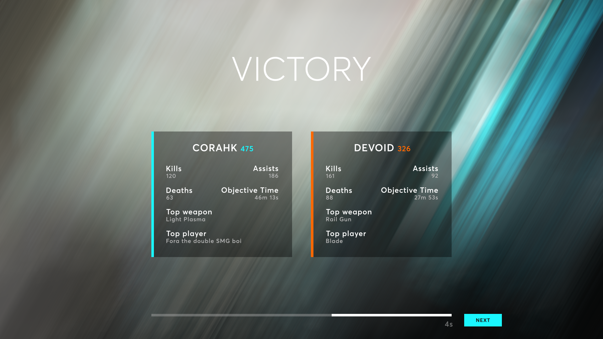
Team-based stats will show first, which provide a general overview of how each team performed.
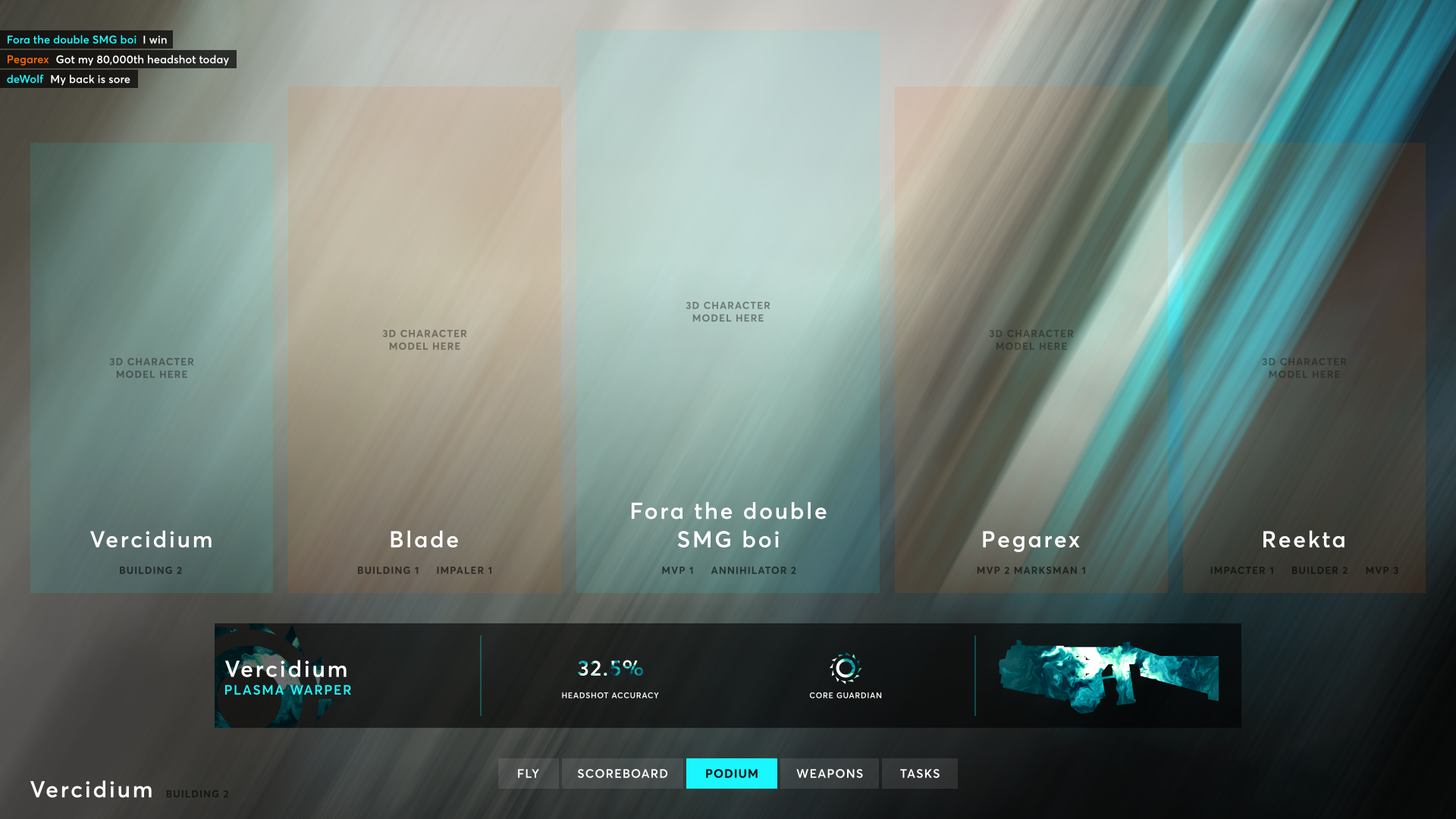
On the Podium tab, you can click on each of the top 5 players to view their Player ID. If you don't land in the top 5, you can see your personal medals in the bottom-left.
On the Weapons tab, you can view your progression towards unlocking weapon Attachment Points and Titles. On the Tasks tab, you can view the progression you've made in Allegiance-specific Tasks.
Tasks
Each new Allegiance comes with 10 Tasks, which are composed of multiple criteria. By completing Tasks, players advance in their Allegiance standing and earn Allegiance-specific rewards:
- New weapons
- New characters
- New skins
- New attachments
For a long time players have been asking for rewards and unlocks that aren't Proton-based, and our goal with the Task + Allegiance system is to create a compelling, rewarding and unique progression system.
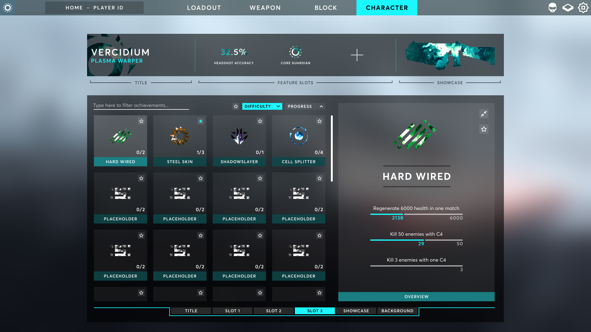
Once a player completes a Task, they can display it on their Player ID for all to see.
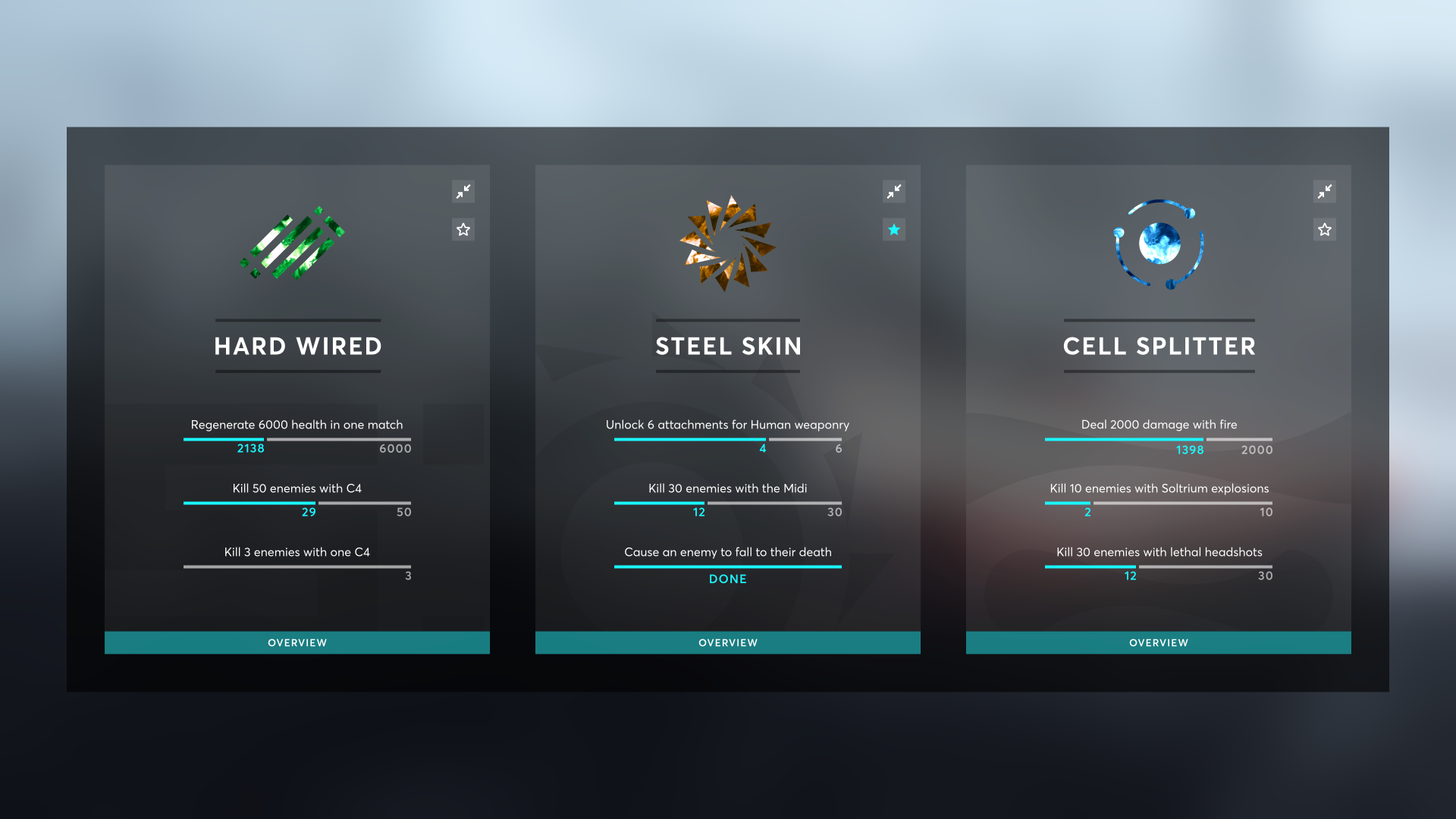
Each task has a unique icon and are colour-coded to their respective Allegiance. For example the three tasks below are associated with Soltec, Corahk and Irridyne:
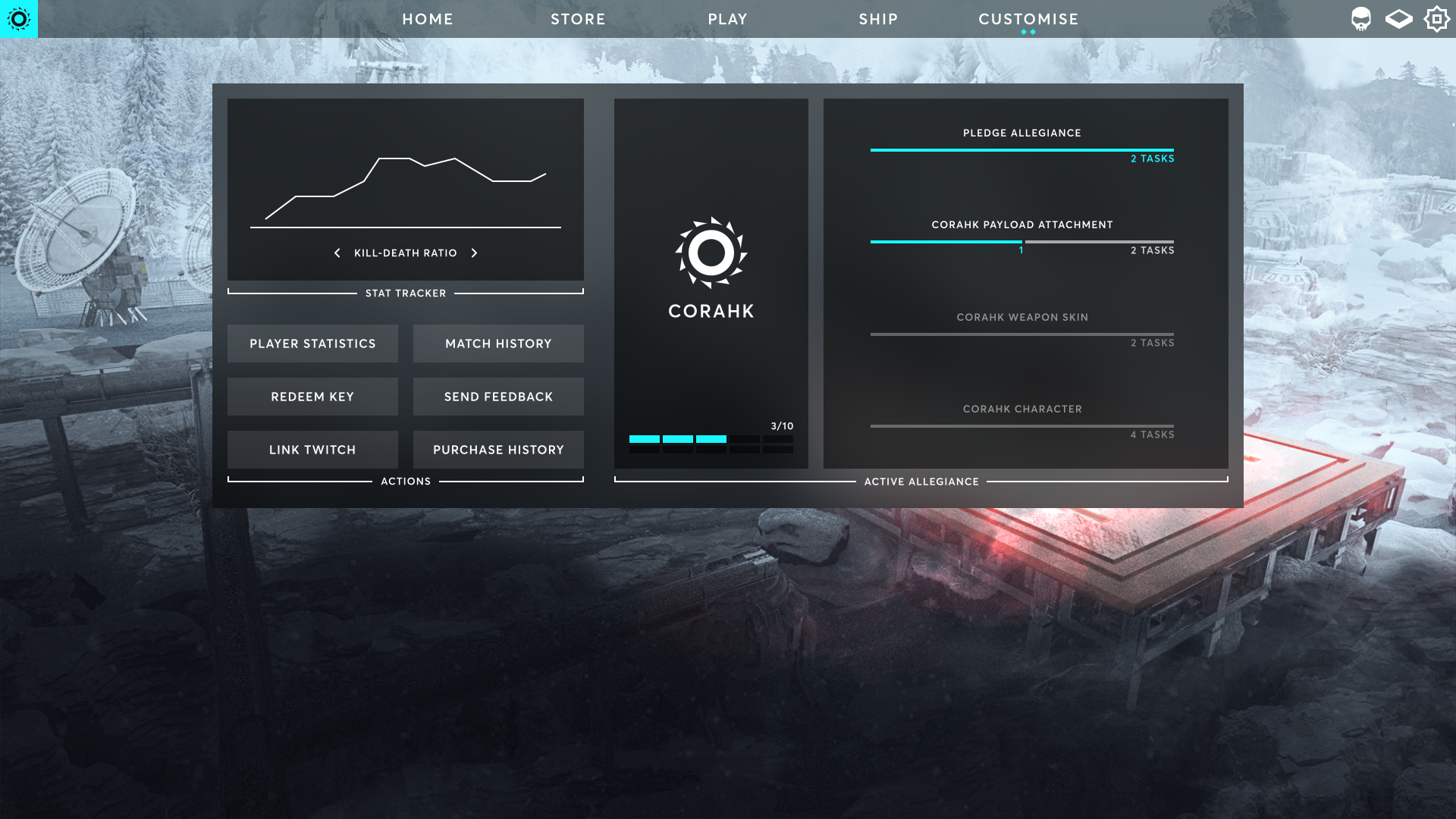
Players can view their Allegiance progression and upcoming rewards on their full-page dashboard, accessed by clicking the icon in the top-left:
All mercenaries begin their journey as a Devoid, who pledge to no one but themselves and their personal gain. They are renegades, outlaws and mercenaries. They run the Arena on an undisclosed planet, where players compete to gain Soltrium for themselves. This alludes to questions like 'where is the Arena getting its Soltrium? Who shot down the freighter?'
More information on the 6 new Allegiances will be available soon.
Character Customisation
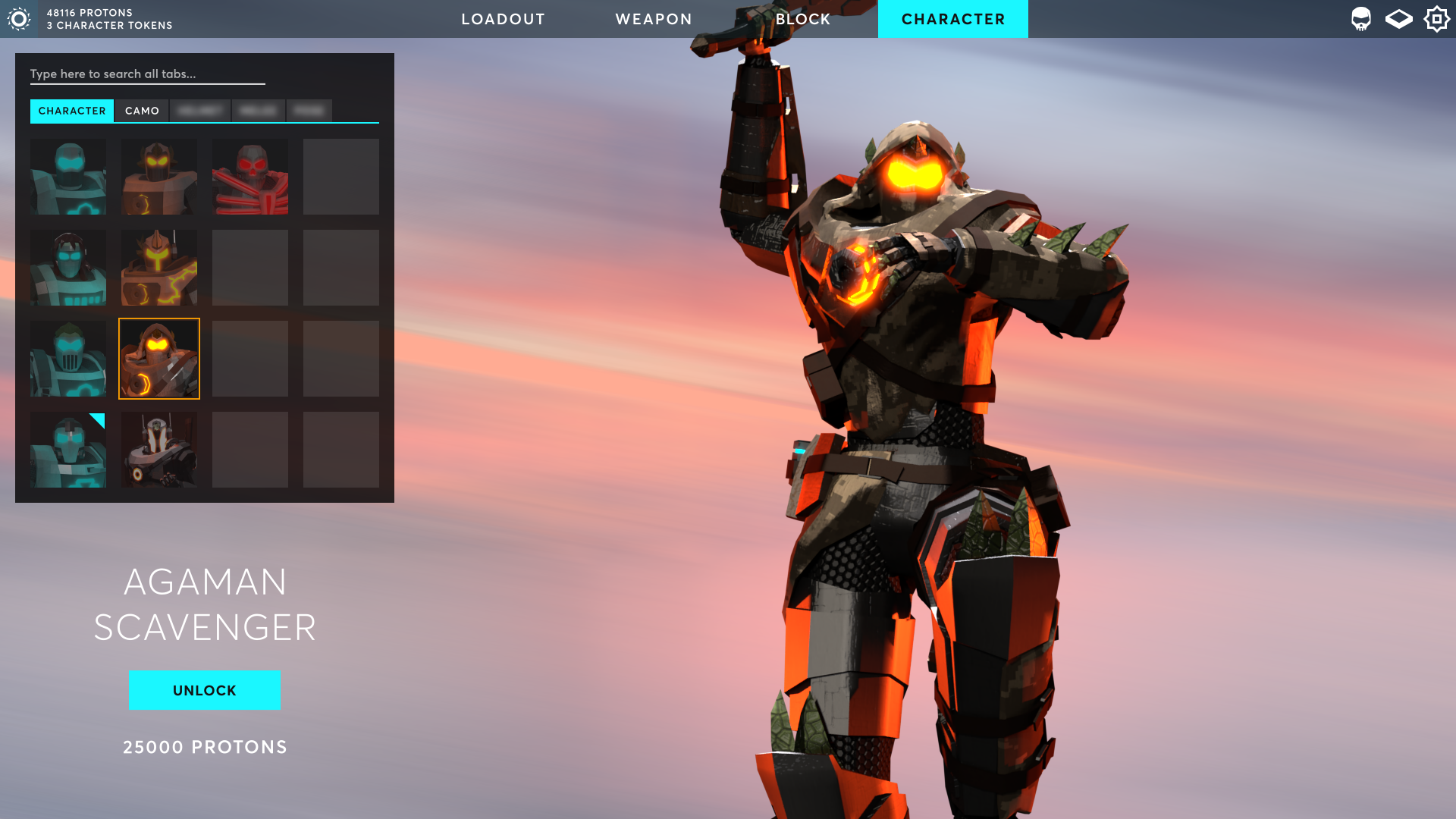
The character screen has also received an upgrade and allows you to customise more than just your character's skin, but we're not ready to share the details of this just yet...
Audio Raycasting
Verc has been working on combining 3D audio with raytracing to create accurate directional echo, reverb and occlusion effects. Check out the video description for the full details:
The Future
There is a lot more that I would like to pack into this post but I'd rather you experience it yourself when the beta is available.
We have been working closely with Juan Moreno over the past few weeks as we fell in love with his style. We'll share more of his works soon!
Punch Deck is working on 12 new underscoring tracks that will play in-game to build up the atmosphere that we're seeking to create. We also recently started working with poxlstudio, who is creating new SFX for the game:
And lastly, we recently partnered with Dusk Marketing, who will be helping to get this game out there and in the hands of more players. It's about time!
We hope you all have a great Christmas break and enjoy your time with your family and friends. Verc just started his two-week break from his day job and will be powering through his massive to-do list and have the beta ready in a few days.
Thank you all for support and patience, we hope we are building a game that you will love and enjoy and we can't wait to for you to experience the next few updates.
See you at the Sector's Edge!
- Verc and Rocket